Hey Amazon, let’s make navigating digital books even better
Summary: Gesture adds new ways to interact with navigation in digital spaces.
This all began with a basic frustration I have with tap-based interaction. From there, it kind of got away from me. I ended up with a slightly new twist on gesture-based navigation, one that’s (hopefully) scalable and intuitive.
But first things first — it’s easy to pick on Amazon because they’re the big guys; but actually, I love my Kindle app for iOS. I really do. Yes, the typography is a tad rough and the column width on the screen of my deprecated little, older-generation iPod Touch is ugly . . . But I still love it.
Kindle on my iPod has become a doorway into fantastic experience. I use it every day. Because of it, I’ve read Dickens and Austen and Sir Arthur Conan Doyle and a dozen others. I even picked up and conquered an unabridged copy of Victor Hugo’s Les Miserables.
And I’m not afraid to mark books up, highlight favorite passages and piquant quotes, leave myself scribbles and observations to rediscover at some point in the future. I was never willing to do that with physical books. I didn’t want to “ruin” them. With digital, I have no such qualms. In some ways, I’m able to invest more into what I read.
There is one hangup in this beautiful relationship, however: page flips.
Page flips bother me. They feel clunky, make the ride bumpy. They get in the way.
Writer and designer Craig Mod has been talking about this for a while. In a 2010 article about books and the iPad, he said, “The metaphor of flipping pages already feels boring and forced on the iPhone . . . The flow of content no longer has to be chunked into ‘page’ sized bites.”
I think he’s right. Craig defined things like novels and biographies — whose content is essentially linear — as formless content. They’re just text with maybe a few pictures, and their content fits well into pretty much any container you put it in. For formless content in the digital space, page divisions are arbitrary, unnecessary.
I prefer scrolling to read. I once downloaded a Bible app that used scrolling almost perfectly. The app broke the Bible up into chapters, with each chapter being one long, vertical read that I could scroll through from top to bottom. Again, Craig Mod landed on this idea himself: “One simplistic reimagining of book layout would be to place chapters on the horizontal plane with content on a fluid vertical plane.”
Each chapter in the Bible app was one of those fluid vertical planes. I simply scrolled through, and the experience worked. It was beautiful.
I loved it. It just made sense for digital navigation.
Most of the formless content on the web has historically been read this way. It’s a model that people are used to in the digital space, and I think it makes sense to use this interaction paradigm in digital books.
Now, in my case I eventually downloaded a Kindle version of the Bible to my iPod. Kindle won over the individual book apps, but only because I wanted all of my notes and highlights in the same universe. In this case, the bad user experience of constantly switching from one app to another outweighed the bad user experience of page flips. But make no mistake; both experiences felt broken.
Beyond scroll
While sectioning content into scrolling chapters makes a lot more sense than arbitrary page-turn units, I think we can actually go one better. That’s where the magic of gesture comes in.
You see, always before when navigating through content in a digital space, people were bound to essentially two axes of navigation. One could scroll through a content unit from top to bottom or one could jump from content unit to content unit using hyperlinks. Just about every navigational interaction involved moving along one of these two axes.
It was largely the mouse that did this to us. Click, click, clicketty-click. Because our interaction with the graphical interfaces was limited to mostly mouse clicks, our ability to navigate in that space had to be limited to what we could easily — and intuitively — do with the mouse. Freeform vertical and lateral motion just aren’t that intuitive with a little clicky guy. Because of this, interface designers in the past didn’t mess around with vertical and lateral axes much. They stuck to building things that could be manipulated with a pointer and a keyboard.
The scroll wheel started to change things. It was the first shot, the yell of the proletariate first awakening to their oppression by the aristocrats.
Now with touch, the revolution is upon us.

Touch truly is a game changer, but not because we couldn’t build better navigational interfaces before. The reason things are different now is because it was never intuitive before. Touch changed that, and this is incredibly exciting for people who think about and build interfaces . . . which brings us back to books.
Zooming up
With pinch and swipe, touch opens up new ways to intuitively navigate among content-units vertically and laterally.
What do I mean by that? Imagine you are reading a passage of Charles Dickens’ David Copperfield. You stumble upon a particular turn of phrase, which reminds you of something you read in, say, Alexandre Dumas’ The Three Musketeers. You decide to go check to see what the original quote was.
In my (admittedly older) version of Kindle’s iOS app, the process to find that quote would be something like this:
- Tap to bring up the navigational interface.
- Tap the hamburger menu icon to bring up the menu.
- Tap the Library option to go to the Library.
- Tap the The Three Musketeers book cover to open the book.
- Tap to bring up the navigational interface.
- Tap the hamburger menu icon to bring up the menu.
- Tap the Table of Contents option to go to the chapter menu (if there is one for your copy of the book) or scroll to the correct chapter in the flyout table of contents menu.
- Tap the link for the chapter you want.
- Tap or swipe to page turn forward until you find the right place.
Look at that. Tap, tap, tap, tap, tapitty-tap-tap-tap. Good for dancing. Bad for reading. It’s the mouse-based interaction model simply overlaid with a tap instead of a click. Navigation is still on the old, hyperlinking axis.
We can do better.
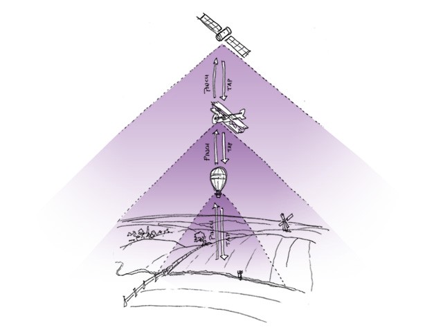
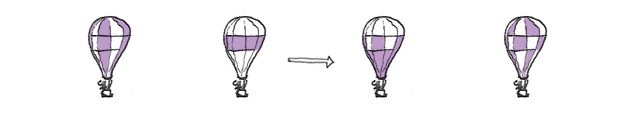
This is where pinch — navigating vertically — can really help. Since page divisions are no longer necessary in digital space, let’s assume for a moment that the chapter, not the page, is the basic content unit of the book. This is ground level. A fluid vertical plane of text. An open field. We can move around within the field by scrolling up or down.

With a pinch, we can go up. Suddenly, we zoom out to the 10,000 foot level. At this level the interface displays a countryside of chapters, a neatly ordered grid of different fields. It’s an automatic, visually-arranged table of contents. We see an entire book at one glance. A

Yet another pinch brings us to the 30,000 foot level. At these awesome heights, we see not a local countryside but an entire state, a network of countrysides. This is a bookshelf. Where before we saw a grid of chapters, here we see a grid of whole books.

One last pinch takes us to the stratosphere. Welcome to the library level. Up here are the meta categories, book types. These may be either arranged by media type, as Kindle currently does it (books, documents, etc.), or perhaps by genre.

To float back down to lower levels, we simply tap the desired destination. (Hey! Tap is still useful — and intuitive — for some things. We certainly don’t want to throw out the baby with the bathwater. . . .)
Navigating around the grid on each higher level is done with scrolling, just as it is on the chapter/content unit level.
Our new Dickens-to-Dumas process would look like this:
- Pinch to zoom out to the chapter menu level.
- Pinch again to zoom out to the books menu level.
- Tap the The Three Musketeers book cover to open the book.
- Pinch to zoom out to the chapter menu level.
- Tap the the chapter we want.
- Scroll to the the right place.
There! Doesn’t that feel better? No non-intuitive tapping through messy intermediate menus. Just pure, quick gesture.
But that’s not all we can do. There’s also the swipe.
Going sideways
While scrolling navigates within a content unit, swiping could navigate between adjacent content units. In other words, scrolling moves around within chapter 1, while swiping moves from chapter 1 to chapter 2 to chapter 3 and so on.
This could also work on the 10,000 foot and 30,000 foot level. On the 10,000 foot level, a swipe might navigate back and forth between the chapter menus (tables of contents) of different books. On the 30,000 foot level, swiping back and forth would navigate among genres or media types. (On the stratosphere level, there would be no swipe simply because there would be no sister categories to move to. We would already be looking over our entire library.)
So, for our Dickens-to-Dumas example, if The Three Musketeers was adjacent to David Copperfield in our library, we might have a third option that looked something like this:
- Pinch to zoom out to the chapter menu level.
- Swipe sideways to move from the David Copperfield chapter menu to the The Three Musketeers chapter menu.
- Tap the link for the chapter we want.
- Scroll to the the right place.
Ah, simplicity!
Of course by now, you’ve probably realized that what I’m describing is not just for books. It can work in any environment in which content is arranged into tiers of categories, and it can scale from two levels to a thousand. News and magazine websites could operate this way. Articles would replace chapters in the model. Sections — sports or politics or lifestyle — would replace books. The names and places would change, but the interaction would be the same.
“The end” is the next beginning
One last thing and then I’m done: It would be wonderful to see the content units seamed together into an infinite scroll. When a reader reached the end of a chapter, it would be beautiful if continuing to scroll brought up the next chapter — after a modest but respectful amount of space of course. Similarly, when a reader reached the last page of a book, why not scroll on to the first page of the next book? And when one reached the end of a genre of books, why not scroll on to the next genre?
It may be an errant fantasy, but even with the great mobility that pinch and swipe can add, I kind of like the idea of being able to simply scroll one’s way from the front cover of the first book in one’s library to the back cover of the last book in one’s library without ever leaving ground level.
The flow of our content should only be broken when we choose to break it . . . in order to go somewhere else we want to go. I love my Kindle app for iOS — I really do! But please, no page flips.
For now, I just want to read.
Notes
A lot of the inspiration behind this post came from Craig Mod’s writing and speaking about digital books, especially his essay Books in the age of the iPad. You should read what he has to say.
Rate this note
Level-up your storytelling
Understand how stories work. Spend less time wrangling your stories into shape and more time writing them.